|
Multiple-item widgets inherit from Gtk::Container; just as
with Gtk::Bin, you use the add() and remove() methods
to add and remove contained widgets. Unlike Gtk::Bin::remove(),
however, the remove() method for Gtk::Container takes an
argument, specifiying which widget to remove.
You've probably noticed that gtkmm windows seem "elastic" - they can usually be stretched in many different ways. This is due to the widget packing system. Many GUI toolkits require you to precisely place widgets in a window, using absolute positioning, often using a visual editor. This leads to several problems:
gtkmm uses the packing system to solve these problems. Rather than specifying the position and size of each widget in the window, you can arrange your widgets in rows, columns, and/or tables. gtkmm can size your window automatically, based on the sizes of the widgets it contains. And the sizes of the widgets are, in turn, determined by the amount of text they contain, or the minimum and maximum sizes that you specify, and/or how you have requested that the available space should be shared between sets of widgets. You can perfect your layout by specifying padding distance and centering values for each of your widgets. gtkmm then uses all this information to resize and reposition everything sensibly and smoothly when the user manipulates the window. gtkmm arranges widgets hierarchically, using containers. A Container widget contains other widgets. Most gtkmm widgets are containers. Windows, Notebook tabs, and Buttons are all container widgets. There are two flavours of containers: single-child containers, which are all descendants of Gtk::Bin, and multiple-child containers, which are descendants of Gtk::Container. Most widgets in gtkmm are descendants of Gtk::Bin, including Gtk::Window. Yes, that's correct: a Window can contain at most one widget. How, then, can we use a window for anything useful? By placing a multiple-child container in the window. The most useful container widgets are Gtk:VBox, Gtk::HBox, and Gtk::Table:
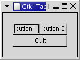
There are several other containers, which we will also discuss. If you've never used a packing toolkit before, it can take some getting used to. You'll probably find, however, that you don't need to rely on visual form editors quite as much as you might with other toolkits. Let's take a look at a slightly improved helloworld, showing what we've learnt. File: helloworld.h
#ifndef GTKMM_EXAMPLE_HELLOWORLD_H
#define GTKMM_EXAMPLE_HELLOWORLD_H

#include <gtkmm/button.h>
#include <gtkmm/box.h>
#include <gtkmm/window.h>

class HelloWorld : public Gtk::Window
{
public:
  HelloWorld();
  virtual ~HelloWorld();

protected:

  // Signal handlers:
  // Our new improved on_button_clicked(). (see below)
  virtual void on_button_clicked(Glib::ustring data);

  // Child widgets:
  Gtk::HBox m_box1;
  Gtk::Button m_button1, m_button2;
};

#endif // GTKMM_EXAMPLE_HELLOWORLD_H
File: helloworld.cc
#include "helloworld.h"
#include <iostream>
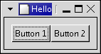
HelloWorld::HelloWorld()
: m_button1("Button 1"),
m_button2("Button 2")
{
// this is a new call, this just sets the title of our new window to
// "Hello Buttons!"
set_title("Hello Buttons!");
// sets the border width of the window.
set_border_width(10);
// put the box into the main window.
add(m_box1);
// Now when the button is clicked, we call the "on_button_clicked" function
// with a pointer to "button 1" as it's argument
m_button1.signal_clicked().connect(SigC::bind<Glib::ustring>( SigC::slot(*this, &HelloWorld::on_button_clicked), "button 1") );
// instead of gtk_container_add, we pack this button into the invisible
// box, which has been packed into the window.
// note that the pack_start default arguments are Gtk::EXPAND | Gtk::FILL, 0
m_box1.pack_start(m_button1);
// always remember this step, this tells GTK that our preparation
// for this button is complete, and it can be displayed now.
m_button1.show();
// call the same signal handler with a different argument,
// passing a pointer to "button 2" instead.
m_button2.signal_clicked().connect(SigC::bind<Glib::ustring>( SigC::slot(*this, &HelloWorld::on_button_clicked), "button 2") );
m_box1.pack_start(m_button2);
// Show the widgets.
// They will not really be shown until this Window is shown.
m_button2.show();
m_box1.show();
}
HelloWorld::~HelloWorld()
{
}
// Our new improved signal handler. The data passed to this method is
// printed to stdout.
void HelloWorld::on_button_clicked(Glib::ustring data)
{
std::cout << "Hello World - " << data << " was pressed" << std::endl;
}
File: main.cc
#include <gtkmm/main.h>
#include "helloworld.h"

int main (int argc, char *argv[])
{
  Gtk::Main kit(argc, argv);

  HelloWorld helloworld;
  Gtk::Main::run(helloworld); //Shows the window and returns when it is closed.

  return 0;
}
After building and running this program, try resizing the window to see the behaviour. Also, try playing with the options to pack_start() while reading the Boxes section. TODO: Use 'Standard Library' instead of STL. If you're an accomplished C++ programmer, you'll be happy to hear that most of the gtkmm Container widgets provide STL-style APIs, available via accessor methods, such as Gtk::Box::children() or Gtk::Notebook::pages(). They don't use actual STL containers (there are good reasons for this), but they look, feel, and act much like STL container classes. These APIs are so similar to STL container APIs that, rather than explaining them in detail, we can refer you to the STL documentation for most of their methods. This is all part of gtkmm's policy of reusing existing standards. However, STL-style APIs can require awkward or lengthy code in some situations, so some people prefer not to use them, while other people use them religiously. Therefore, you are not forced to use them - most container widgets have a simpler non-STL-style API, with methods such as append() and prepend(). At a minimum, gtkmm container lists support iterators and the usual insertion, deletion, and addition methods. You can always expect the following methods to be available for gtkmm STL-style APIs:
Also, the [] operator is overloaded, but that it's usually order N, so if performance is a consideration, or the list has a large number of elements, think carefully before using it. The element objects and list objects are defined, for each container, in a namespace whose name ends in _Helpers. For example, the helper namespace for the notebook widget is Gtk::Notebook_Helpers. There is a major difference between gtkmm STL-style APIs and real STL containers. Normally, when you use a std::vector, for example, you expect that whatever you put in, you'll get out, unmodified. You wouldn't make a std::vector<int> and expect to get doubles out of it. But, gtkmm STL-style APIs don't always work like that - you will often put one kind of object in, and later get a different kind out. Why this odd behaviour? Consider a menu widget, which must maintain a hierarchical list of menus and menu items. Menus can only contain certain objects, such as menu items, separators, and submenus. To ensure consistency, a "filter" is needed to keep out illegal objects. Also, since only a few types of objects are allowed, convenience methods can be provided to make it easy to build up menus. gtkmm takes care of both requirements using special helper elements. Helper elements are temporary - they're typically constructed and passed to an insertion method in the same call. The list insertion method uses the information in the helper element to construct the real object, which is then inserted into the container. As an example, let's look at the Notebook widget (explained in the section on Notebooks). Notebook widgets contain a series of "pages". Each page in a notebook requires, at minimum, the following information:
(The gtkmm notebook widget keeps other data for each page as well.) To insert a new page in a notebook, we can use one of the notebook helper classes, like this:
notebook->pages().push_back(
          Gtk::Notebook_Helpers::TabElem(*frame, bufferl));
Let's see what's going on here. Assume we have a pointer to a Notebook widget called notebook; we go from that to a member method called pages(), which returns an STL-like list object. On this we call the method push_back() (this should be familiar to those who know STL). The object that the pages() method returns is called a Notebook_Helpers::PageList. It's one of the STL-like containers that we keep referring to. Let's take a look at this class (this has been heavily edited for clarity; see <gtkmm/notebook.h> for the actual definition):
namespace Notebook_Helpers
{
    class PageList
    {
    public:
             . . .
        void push_back(const Element& e);
             . . .
        Page* operator[](size_type l);
    };
};
There are two important things to notice here:
This scheme has some important advantages:
All multi-item containers have an Element object in their helper namespaces, and usually there are additional classes available (like TabElem and MenuElem) which derive from Element. Element classes vary from container to container, since each contains different kinds of objects. It's very important to remember that Elements are not "real" objects. They exist only temporarily, and they are never stored in the container. They are used only as temporary "parameter-holders". Therefore, the following segment of code is illegal:
MenuElem* m = new MenuElem("hello");
m->right_justify();
items().push_back(*m);
We constructed a new MenuElem helper object, and then tried to invoke right_justify() on it before adding it to the menu. The trouble is that there is no right_justify() method in the MenuElem class. The correct way to accomplish this would be:
items().push_back(MenuElem("hello"));
items().back()->right_justify();
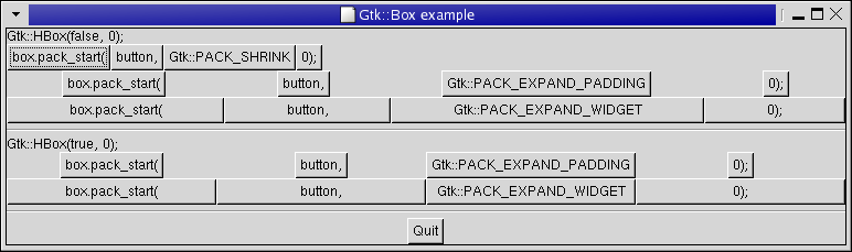
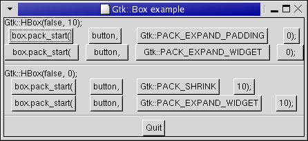
Here, we've constructed a MenuElem and inserted it into the menu by passing it to push_back(), causing the real menu item to be created. We've then called right_justify() on the object retrieved from the list. This is correct - the object retrieved from the list is not a MenuElem, but a real MenuItem, and therefore supports the right_justify() method as expected. Most packing uses boxes as in the above example. These are invisible containers into which we can pack our widgets. When packing widgets into a horizontal box, the objects are inserted horizontally from left to right or right to left depending on whether pack_start() or pack_end() is used. In a vertical box, widgets are packed from top to bottom or vice versa. You may use any combination of boxes inside or beside other boxes to create the desired effect. The pack_start() and pack_end() methods place widgets inside these containers. The pack_start() method will start at the top and work its way down in a VBox, or pack left to right in an HBox. pack_end() will do the opposite, packing from bottom to top in a VBox, or right to left in an HBox. Using these methods allows us to right justify or left justify our widgets. We will use pack_start() in most of our examples. There are several options governing how widgets are be packed, and this can be confusing at first. If you have difficulties then it is sometimes a good idea to play with the glade GUI designer to see what is possible. You might even decide to use the libglademm API to load your GUI at runtime. There are basically five different styles, as shown in this picture: Each line contains one horizontal box (HBox) with several buttons. Each of the buttons on a line is packed into the HBox with the same arguments to the pack_start() method). This is the declaration of the pack_start() method: void pack_start(Gtk::Widget& child, PackOptions options = PACK_EXPAND_WIDGET, guint padding = 0); The first argument is the widget you're packing. In our example these are all Buttonss. The options argument can take one of these three options:
The padding argument specifies the width of an extra border area to leave around the packed widget. Instead of the pack_start() and pack_end() methods, you might prefer to use the STL-style API, available via the children method. See the STL-style APIs section for more details. Here's the constructor for the box widgets: Gtk::Box(bool homogeneous = false, int spacing = 0);Passing true for homogeneous will cause all of the contained widgets to be the same size. spacing is a (minimum) number of pixels to leave between each widget. What's the difference between spacing (set when the box is created) and padding (set when elements are packed)? Spacing is added between objects, and padding is added on either side of a widget. The following figure should make it clearer: Here is the source code for the example that produced the screenshots above. When you run this example, provide a number between 1 and 3 as a command-line option, to see different packing options in use. File: examplewindow.h
#ifndef GTKMM_EXAMPLEWINDOW_H
#define GTKMM_EXAMPLEWINDOW_H

#include <gtkmm.h>

class ExampleWindow : public Gtk::Window
{
public:
  ExampleWindow();
  virtual ~ExampleWindow();

protected:
  //Signal handlers:
  virtual void on_button_clicked();

  //Child widgets:
  Gtk::Alignment m_Alignment;
  Gtk::Button m_Button;
};

#endif //GTKMM_EXAMPLEWINDOW_H
File: examplewindow.cc
#include "examplewindow.h"

ExampleWindow::ExampleWindow()
: m_Alignment(Gtk::ALIGN_RIGHT, Gtk::ALIGN_CENTER, 0.0, 0.0),
  m_Button("Close")
{
  set_title("Gtk::Alignement");
  set_border_width(10);
  set_default_size(200, 50);

  add(m_Alignment);

  m_Alignment.add(m_Button);

  m_Button.signal_clicked().connect( SigC::slot(*this, &ExampleWindow::on_button_clicked) );

  show_all_children();
}

ExampleWindow::~ExampleWindow()
{
}

void ExampleWindow::on_button_clicked()
{
  hide();
}
File: main.cc
#include <gtkmm/main.h>
#include "examplewindow.h"

int main(int argc, char *argv[])
{
  Gtk::Main kit(argc, argv);

  ExampleWindow window;
  Gtk::Main::run(window); //Shows the window and returns when it is closed.

  return 0;
}
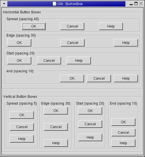
Button boxes are a convenient way to quickly arrange a group of buttons. They come in both horizontal (Gtk::HButtonBox) and vertical (Gtk::VButtonBox) flavours. They are exactly alike, except in name and orientation. ButtonBoxes help to make applications appear consistent because they use standard settings, such as inter-button spacing and packing. Buttons are added to a ButtonBox with the add() method. Button boxes support several layout styles. The style can be retrieved and changed using get_layout() and set_layout(). File: examplebuttonbox.h
#ifndef GTKMM_EXAMPLE_BUTTONBOX_H
#define GTKMM_EXAMPLE_BUTTONBOX_H

#include <gtkmm.h>

class ExampleButtonBox : public Gtk::Frame
{
public:
  ExampleButtonBox(bool horizontal,
       const Glib::ustring& title,
       gint spacing,
       Gtk::ButtonBoxStyle layout);

protected:
  Gtk::Button m_Button_OK, m_Button_Cancel, m_Button_Help;
};

#endif //GTKMM_EXAMPLE_BUTTONBOX_H
File: examplewindow.h
#ifndef GTKMM_EXAMPLEWINDOW_H
#define GTKMM_EXAMPLEWINDOW_H

#include <gtkmm.h>

class ExampleWindow : public Gtk::Window
{
public:
  ExampleWindow();
  virtual ~ExampleWindow();

protected:
  //Signal handlers:
  virtual void on_button_clicked();

  //Child widgets:
  Gtk::VBox m_VBox_Main, m_VBox;
  Gtk::HBox m_HBox;
  Gtk::Frame m_Frame_Horizontal, m_Frame_Vertical;
};

#endif //GTKMM_EXAMPLEWINDOW_H
File: examplebuttonbox.cc
#include "examplebuttonbox.h"

ExampleButtonBox::ExampleButtonBox(bool horizontal,
       const Glib::ustring& title,
       gint spacing,
       Gtk::ButtonBoxStyle layout)
: Gtk::Frame(title),
  m_Button_OK("OK"),
  m_Button_Cancel("Cancel"),
  m_Button_Help("Help")
{
  Gtk::ButtonBox* bbox = 0;

  if(horizontal)
    bbox = Gtk::manage( new Gtk::HButtonBox() );
  else
    bbox = Gtk::manage( new Gtk::VButtonBox() );

  bbox->set_border_width(5);

  add(*bbox);

  /* Set the appearance of the Button Box */
  bbox->set_layout(layout);
  bbox->set_spacing(spacing);

  bbox->add(m_Button_OK);
  bbox->add(m_Button_Cancel);
  bbox->add(m_Button_Help);
}
File: examplewindow.cc
#include "examplewindow.h"
#include "examplebuttonbox.h"

ExampleWindow::ExampleWindow()
: m_Frame_Horizontal("Horizontal Button Boxes"),
  m_Frame_Vertical("Vertical Button Boxes")
{
  set_title("Gtk::ButtonBox");
  add(m_VBox_Main);

  m_VBox_Main.pack_start(m_Frame_Horizontal, Gtk::PACK_EXPAND_WIDGET, 10);

  //The horizontal ButtonBoxes:
  m_VBox.set_border_width(10);
  m_Frame_Horizontal.add(m_VBox);

  m_VBox.pack_start( *Gtk::manage( new ExampleButtonBox(true, "Spread (spacing 40)",
                                      40, Gtk::BUTTONBOX_SPREAD)),
     Gtk::PACK_EXPAND_WIDGET, 0);

  m_VBox.pack_start( *Gtk::manage( new ExampleButtonBox(true, "Edge (spacing 30)",
                                30, Gtk::BUTTONBOX_EDGE)),
     Gtk::PACK_EXPAND_WIDGET, 5);

  m_VBox.pack_start( *Gtk::manage( new ExampleButtonBox(true, "Start (spacing 20)",
                                      20, Gtk::BUTTONBOX_START)),
     Gtk::PACK_EXPAND_WIDGET, 5);

  m_VBox.pack_start( *Gtk::manage( new ExampleButtonBox(true, "end (spacing 10)",
                                      10, Gtk::BUTTONBOX_END)),
     Gtk::PACK_EXPAND_WIDGET, 5);


  //The vertical ButtonBoxes:
  m_VBox_Main.pack_start(m_Frame_Vertical, Gtk::PACK_EXPAND_WIDGET, 10);


  m_HBox.set_border_width(10);
  m_Frame_Vertical.add(m_HBox);

  m_HBox.pack_start( *Gtk::manage( new ExampleButtonBox(false, "Spread (spacing 5)",
                                      5, Gtk::BUTTONBOX_SPREAD)),
      Gtk::PACK_EXPAND_WIDGET, 0);

  m_HBox.pack_start( *Gtk::manage( new ExampleButtonBox(false, "Edge (spacing 30)",
                                     30, Gtk::BUTTONBOX_EDGE)),
      Gtk::PACK_EXPAND_WIDGET, 5);

  m_HBox.pack_start( *Gtk::manage( new ExampleButtonBox(false, "Start (spacing 20)",
                                      20, Gtk::BUTTONBOX_START)),
      Gtk::PACK_EXPAND_WIDGET, 5);

  m_HBox.pack_start( *Gtk::manage( new ExampleButtonBox(false, "End (spacing 10)",
                                      10, Gtk::BUTTONBOX_END)),
      Gtk::PACK_EXPAND_WIDGET, 5);


  show_all_children();
}

ExampleWindow::~ExampleWindow()
{
}

void ExampleWindow::on_button_clicked()
{
  hide();
}
File: main.cc
#include <gtkmm/main.h>
#include "examplewindow.h"

int main(int argc, char *argv[])
{
  Gtk::Main kit(argc, argv);

  ExampleWindow window;
  Gtk::Main::run(window); //Shows the window and returns when it is closed.

  return 0;
}
Tables allows us to place widgets in a grid. The grid's dimensions need to be specified in the constructor: Gtk::Table(int rows = 1, int columns = 1, bool homogeneous = false); The first argument is the number of rows to make in the table, while the second, obviously, is the number of columns. If homogeneous is true, the table cells will all be the same size (the size of the largest widget in the table). The rows and columns are indexed starting at 0. If you specify rows = 2 and columns = 2, the layout would look something like this:
 0          1          2
0+----------+----------+
 |          |          |
1+----------+----------+
 |          |          |
2+----------+----------+
Note that the coordinate system starts in the upper left hand corner. To place a widget into a box, use the following method:
void Gtk::Table::attach(Gtk::Widget& child,
                        guint left_attach, guint right_attach,
                        guint top_attach, guint bottom_attach,
                        guint xoptions = Gtk::FILL | Gtk::EXPAND,
                        guint yoptions = Gtk::FILL | Gtk::EXPAND,
                        guint xpadding = 0, guint ypadding = 0);
The first argument is the widget you wish to place in the table. The left_attach and right_attach arguments specify where to place the widget, and how many boxes to use. For example, if you want a button in the lower-right cell of a 2 x 2 table, and want it to occupy that cell only, then left_attach would be 1, right_attach 2, top_attach 1, and bottom_attach 2. If, on the other hand, you wanted a widget to take up the entire top row of our 2 x 2 table, you'd set left_attach = 0, right_attach = 2, top_attach = 0, and bottom_attach = 1. xoptions and yoptions are used to specify packing options and may be bitwise ORed together to allow multiple options. These options are:
The padding arguments work just as they do for pack_start(). set_row_spacing() and set_col_spacing() set the spacing between the rows at the specified row or column. Note that for columns, the space goes to the right of the column, and for rows, the space goes below the row. You can also set a consistent spacing for all rows and/or columns with set_row_spacings() and set_col_spacings(). Note that with these calls, the last row and last column do not get any spacing. In the following example, we make a window with three buttons in a 2 x 2 table. The first two buttons will be placed in the upper row. A third button is placed in the lower row, spanning both columns. File: examplewindow.h
#ifndef GTKMM_EXAMPLEWINDOW_H
#define GTKMM_EXAMPLEWINDOW_H

#include <gtkmm.h>

class ExampleWindow : public Gtk::Window
{
public:
  ExampleWindow();
  virtual ~ExampleWindow();

protected:

  //Child widgets:
  Gtk::AspectFrame m_AspectFrame;
  Gtk::DrawingArea m_DrawingArea;
};

#endif //GTKMM_EXAMPLEWINDOW_H
File: examplewindow.cc
#include "examplewindow.h"

ExampleWindow::ExampleWindow()
: m_AspectFrame("2x1", /* label */
    Gtk::ALIGN_CENTER, /* center x */
    Gtk::ALIGN_CENTER, /* center y */
    2.0, /* xsize/ysize = 2 */
    false /* ignore child's aspect */)
{
  set_title("Aspect Frame");
  set_border_width(10);

  // Add a child widget to the aspect frame */
  // Ask for a 200x200 window, but the AspectFrame will give us a 200x100
  // window since we are forcing a 2x1 aspect ratio */
  m_DrawingArea.set_size_request(200, 200);
  m_AspectFrame.add(m_DrawingArea);

  // Add the aspect frame to our toplevel window:
  add(m_AspectFrame);

  show_all_children();
}

ExampleWindow::~ExampleWindow()
{
}
File: main.cc
#include <gtkmm/main.h>
#include "examplewindow.h"

int main(int argc, char *argv[])
{
  Gtk::Main kit(argc, argv);

  ExampleWindow window;
  Gtk::Main::run(window); //Shows the window and returns when it is closed.

  return 0;
}
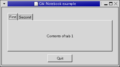
A Notebook has set of stacked pages, each of which contains widgets. Labelled tabs allow the user to select the pages. Notebooks allow several sets of widgets to be placed in a small space, by only showing one page at a time. For instance, they are often used in preferences dialogs. Use the append_page(), prepend_page() and insert_page() methods to add tabbed pages to the Notebook, supplying the child widget and the name for the tab. To discover the currently visible page, use the get_current_page() method. This returns the page number, and then calling get_nth_page() with that number will give you a pointer to the actual child widget. To programmatically change the selected page, use the set_page() method. There is also an STL-style API which you might find more obvious. File: examplewindow.h
#ifndef GTKMM_EXAMPLEWINDOW_H
#define GTKMM_EXAMPLEWINDOW_H

#include <gtkmm.h>

class ExampleWindow : public Gtk::Window
{
public:
  ExampleWindow();
  virtual ~ExampleWindow();

protected:
  //Signal handlers:
  virtual void on_button_quit();

  //Child widgets:
  Gtk::VBox m_VBox;
  Gtk::Notebook m_Notebook;
  Gtk::Label m_Label1, m_Label2;

  Gtk::HButtonBox m_ButtonBox;
  Gtk::Button m_Button_Quit;
};

#endif //GTKMM_EXAMPLEWINDOW_H
File: examplewindow.cc
#include <iostream>
#include "examplewindow.h"

ExampleWindow::ExampleWindow()
: m_Label1("Contents of tab 1"),
  m_Label2("Contents of tab 2"),
  m_Button_Quit("Quit")
{
  set_title("Gtk::Notebook example");
  set_border_width(10);
  set_default_size(400, 200);


  add(m_VBox);

  //Add the Notebook, with the button underneath:
  m_Notebook.set_border_width(10);
  m_VBox.pack_start(m_Notebook);
  m_VBox.pack_start(m_ButtonBox, Gtk::PACK_SHRINK);

  m_ButtonBox.pack_start(m_Button_Quit, Gtk::PACK_SHRINK);
  m_Button_Quit.signal_clicked().connect( SigC::slot(*this, &ExampleWindow::on_button_quit) );

  //Add the Notebook pages:
  m_Notebook.append_page(m_Label1, "First");
  m_Notebook.append_page(m_Label2, "Second");

  show_all_children();
}

ExampleWindow::~ExampleWindow()
{
}

void ExampleWindow::on_button_quit()
{
  hide();
}
File: main.cc
#include <gtkmm/main.h>
#include "examplewindow.h"

int main(int argc, char *argv[])
{
  Gtk::Main kit(argc, argv);

  ExampleWindow window;
  Gtk::Main::run(window); //Shows the window and returns when it is closed.

  return 0;
}
The Gtk::Notebook widget has an STL-style API, available via the pages() method, which you might prefer to use to add and access pages. See the STL-style APIs section for generic information. To insert pages into a notebook, use the TabElem helper class, like so: m_Notebook.pages().push_back( Gtk::Notebook_Helpers::TabElem(m_ChildWidget, "tab 1") ); TabElem Reference. TODO: Correct URL. To access an existing child widget, you can call get_child() on one of the Page elements of the PageList: Gtk::Widget* pWidget = m_Notebook.pages()[2].get_child(); |